Boardable


Helping reconnect users with an accessible mobile and desktop app.

www.boardable.com/

Boardable-Front-image-min

Board Meetings on the go

Established as a startup in 2016, the Boardable app was initially crafted solely by engineers, with no design system in place. This resulted in a limited information structure that led to user dissatisfaction and a decline in mobile app downloads.

To enhance customer loyalty and satisfaction, a uniform and user-centric interface was implemented across both mobile and desktop platforms, consequently boosting revenue.

Role

Research, UX, accessibility,  UI design

Collaborators

Product Manager, Developer

Timeline

2021-2022

Problems

  • Subpar visual design and a suboptimal information architecture left users grappling with navigation challenges within the app, inducing frustration and subsequently resulting in a notable decrease in app usage.


  • The product had insufficient emphasis on web accessibility, a critical aspect for serving non-profit and mission-driven organizations effectively. 

 Solutions

  • Data-Driven Redesign:

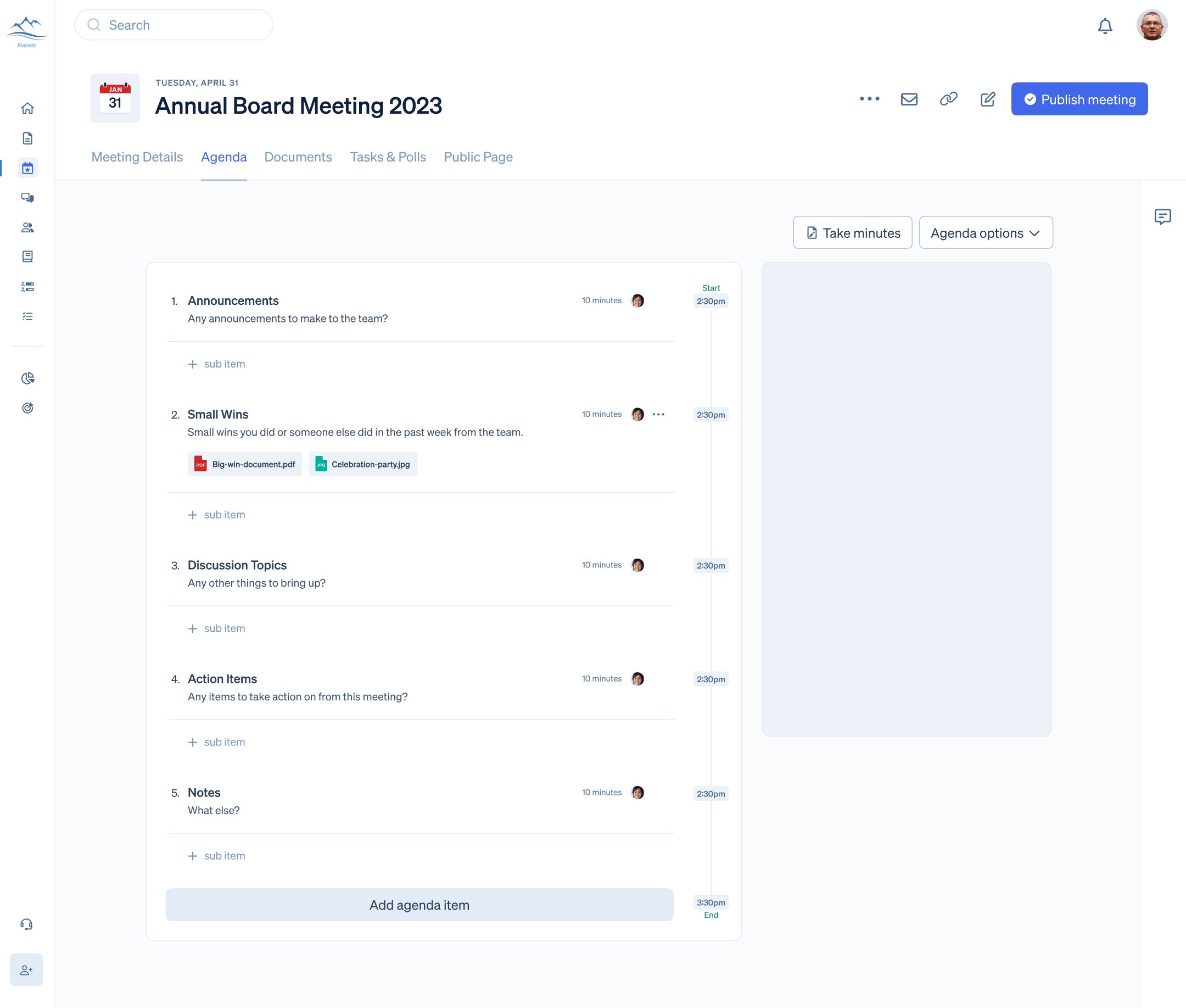
The first step was to initiate a comprehensive redesign of both the desktop and mobile interfaces. This redesign was informed by data-driven decisions, incorporating user feedback, analytics, and usability studies. By prioritizing user-friendliness, the app aimed to create a more intuitive and visually appealing environment for all users.

  • Enhanced Web Accessibility:

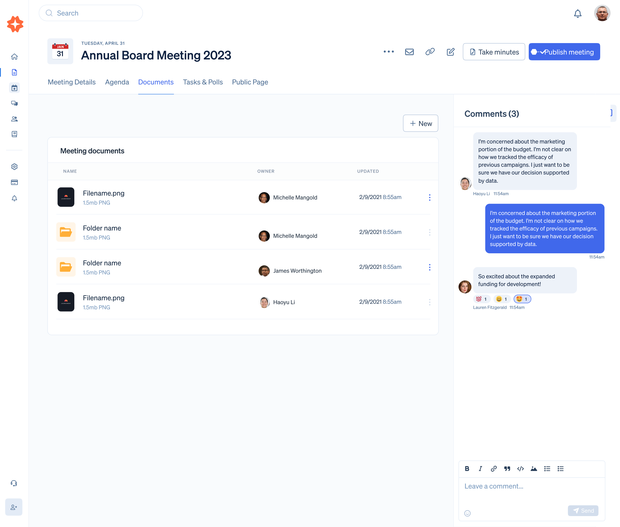
Recognizing the importance of inclusivity, efforts were made to increase web accessibility. This involved adhering to accessibility standards, such as WCAG guidelines, to ensure that the app could be comfortably used by individuals with varying abilities. By making the app accessible to a broader audience, the product became more versatile for managing non-profit and mission-based organizations.

  • Mobile Optimization:

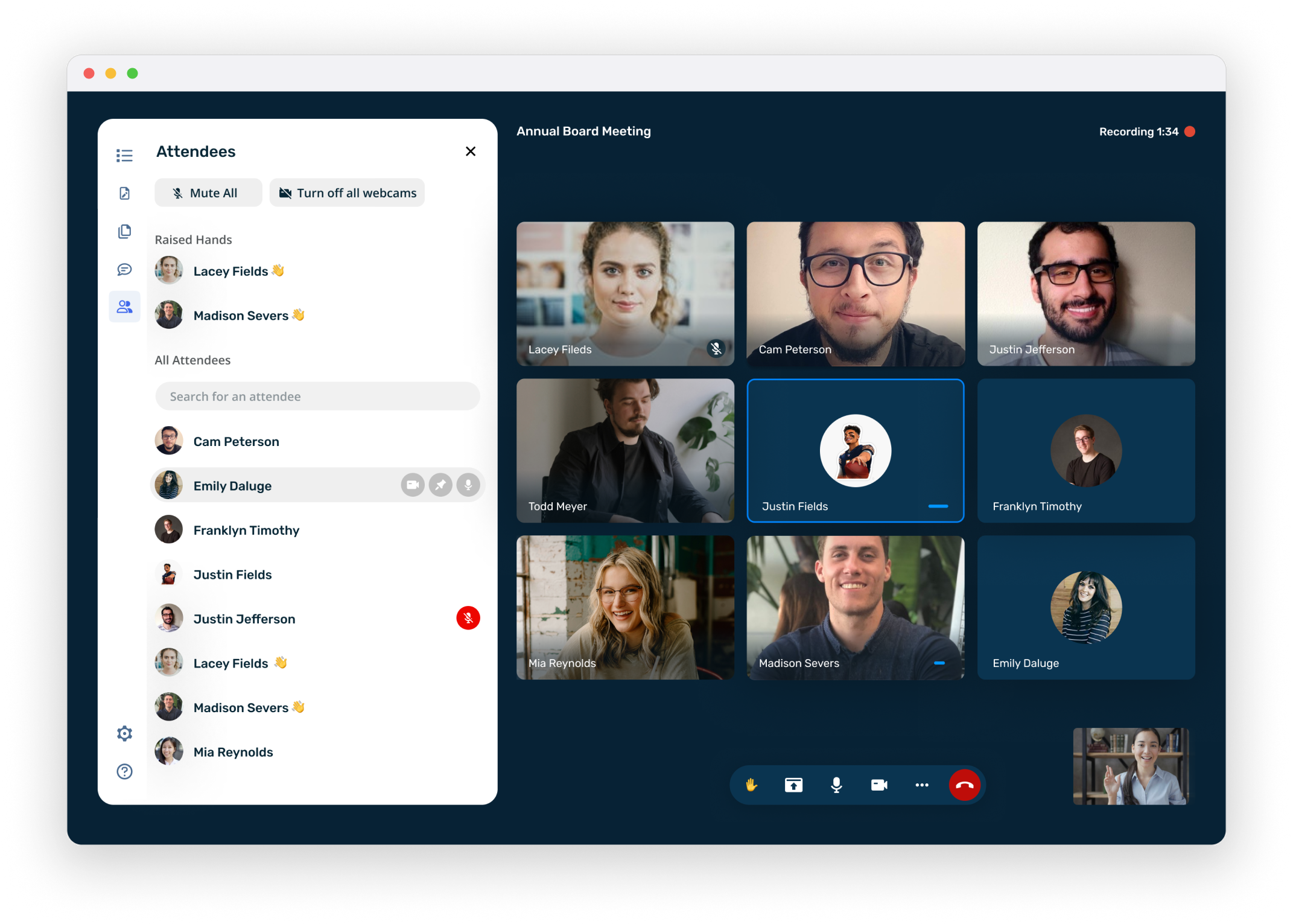
An emphasis was placed on improving the mobile experience. This included optimizing the app's functionality for on-the-go use, enabling users to schedule and participate in meetings seamlessly from their mobile devices. By enhancing the mobile experience, the app became a more versatile tool for users who needed flexibility in managing their organizations.

Research:

Commencing our journey towards a more user-centric app experience, we embarked on a comprehensive UX strategy, which included: 

  • Competitive Analysis:

To gain a profound understanding of our positioning within the market, we initiated a rigorous competitive analysis. This involved scrutinizing similar competitors' offerings, dissecting their strengths and weaknesses, and identifying opportunities for improvement. This step was instrumental in shaping our approach to stand out in a crowded landscape.

  • Data-Driven Insights:

Leveraging data analytics and heat maps, we delved into the intricacies of user interactions within our app. These analytical tools allowed us to pinpoint precisely where users encountered obstacles and confusion. By scrutinizing user behavior, we could uncover pain points and areas in need of refinement, steering our design decisions in the right direction.

  • User Interviews and Empathy:

Recognizing the unique challenges faced by non-profit organizations, we conducted in-depth interviews with our users. These interviews provided us with invaluable insights and allowed us to empathize with their specific frustrations and needs. Understanding the nuances of managing non-profits allowed us to tailor our solutions to cater specifically to their requirements.

  • User Task Flow Optimization:

To streamline the user experience, we meticulously outlined user task flows, with a primary focus on critical actions such as creating meetings, generating agendas, and recording meeting minutes. These task flows were designed with precision, ensuring that each step was intuitive and efficient. By simplifying these processes, we aimed to empower users to accomplish their goals effortlessly.

Screenshot 2023-09-03 at 4.59.16 PM

By embracing these UX methodologies, we not only addressed existing issues but also cultivated a deeper understanding of our user base. This holistic approach enabled us to align our product with user expectations, enhance overall satisfaction, and position ourselves as a more user-friendly solution, especially tailored to the intricacies of non-profit management.

Wireframing:

In pursuit of a user-centric design transformation, we adopted a comprehensive UX approach that included several key steps:

Low-Fidelity Wireframes:
Our design process commenced with the creation of low-fidelity wireframes. These wireframes served as essential blueprints for exploring a multitude of potential solutions rapidly. By maintaining a low-fidelity approach initially, we could iterate swiftly and visualize various design concepts. This approach allowed us to experiment and gather feedback without the distraction of intricate design details.

Simultaneous Mobile and Desktop Mapping:
Recognizing the significance of maintaining a consistent user experience across both mobile and desktop platforms, we engaged in simultaneous mapping for these interfaces. This ensured that the core user experience remained coherent and seamless, regardless of the device used. Consistency is paramount in creating an intuitive and user-friendly product.

Page Hierarchy Optimization:
Central to our design strategy was the meticulous evaluation and refinement of page hierarchy. We placed a strong emphasis on organizing information and actions in a logical and user-friendly manner. Prior to finalizing the design, we subjected our page hierarchy to user testing. This critical step allowed us to validate our design choices and make adjustments based on real user feedback, ensuring that the final design met user expectations and needs.

By adhering to these UX principles, we not only explored a range of design possibilities efficiently but also maintained a seamless cross-platform experience and validated our design decisions through user testing. This holistic approach was instrumental in crafting a user-friendly and intuitive interface that addressed the unique requirements of our target audience, especially those managing non-profits.

Untitled (1)

Visual design solution: 

Given the unique challenges posed by the development history of our desktop application, which was primarily handled by our team of programmers, and the limited capabilities of the mobile interface, we implemented an atomic UI element system. This system encapsulated a range of key UX principles, fostering both user-friendliness and adaptability across various screen sizes, thereby guaranteeing a seamless user experience across all breakpoints.

Here's a deeper exploration of these concepts:

Atomic UI Element System:

The implementation of an atomic UI element system involved breaking down the user interface into its fundamental building blocks. Each UI element, such as buttons, forms, and navigation components, was treated as an atomic unit. This modular approach allowed for a high degree of flexibility and reusability in design and development. It enabled us to maintain consistency throughout the application, as well as facilitate rapid prototyping and updates.
User-Friendly Design:

Central to our approach was the commitment to user-friendliness. By establishing a cohesive system of atomic UI elements, we ensured that users encountered a consistent and intuitive interface across both desktop and mobile devices. This consistency reduced cognitive load and made it easier for users to navigate and interact with the application, ultimately enhancing the overall user experience.
Adaptability Across Screen Sizes:

Recognizing the importance of responsive design, our atomic UI element system was carefully crafted to be adaptable to different screen sizes. This ensured that the application's functionality remained consistent and accessible regardless of the user's device, be it a desktop computer, tablet, or mobile phone. Adaptable design is crucial for accommodating the diverse range of devices in use today.
Seamless Functionality on All Breakpoints:

Our commitment to a responsive design approach meant that the application seamlessly adjusted its layout and interactions to suit various breakpoints or screen resolutions. This flexibility was vital for ensuring that users could access and utilize the application without any loss of functionality, regardless of their preferred device or screen size.

Untitled (2)

Summary:

The app addressed several critical challenges, including limited accessibility, user frustration stemming from visual design and information architecture issues, decreased usage, and internal training requirements. The solutions implemented were data-driven redesigns for both desktop and mobile interfaces, with a strong emphasis on user-friendliness and internal usability. Improvements in web accessibility were introduced to make the app inclusive for diverse users managing organizations. Additionally, significant efforts were directed towards enhancing the mobile experience, enabling users to engage in remote meetings seamlessly while using the app. These comprehensive changes aimed to rectify past issues, promote user satisfaction, and ensure the app's effectiveness for a broader range of users and purposes.

Neer Patel

View