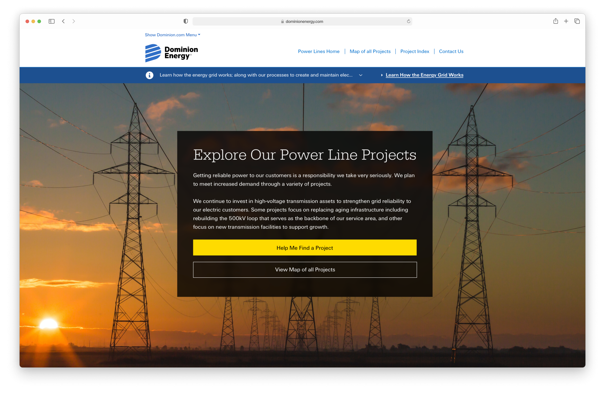
Dominion Energy Powerlines is a microsite that allows residents to understand how construction and maintenance will impact their electric service.
YEAR
2021
ROLE
Research, UX, UI
SITE
INTRODUCTION
With 117 Powerline Projects to manage, the Powerlines team was overwhelmed.
Dominion Energy is an energy company that provides electric and natural gas services to over 3.6 million homes across 7 states in America.
As their Powerline Projects expanded, the challenge of efficiently sharing vital construction-related information with homeowners emerged.
PROBLEMS
Frustration from the company and homeowners paved a new way to interact with Powerlines construction projects.
Dominion Energy is an energy company that provides electric and natural gas services to over 3.6 million homes across 7 states in America.
As their Powerline Projects expanded, the challenge of efficiently sharing vital construction-related information with homeowners emerged.
90%
Powerlines Team felt overwhelmed by calls and emails about construction
68%
Homeowners had more questions when they got powerline information by postcards in the mail
73%
Homeowners stated lost on the website trying to find their location and get construction or maintenance updates
CONSTRAINTS
With no set budget, two bold ideas were planned.
When Dominion Energy approached us for the powerlines project, they didn’t come with a set budget—so we had to get creative.
We designed two paths: one that leaned on existing, cost-friendly components and another where the possibilities were endless. This gave the client flexibility to choose what worked best for their vision and resources.
WIREFRAMING
Fully functional wireframes were used to flesh out both ideas for usability and to get buy in and set the budget.
Two fully functional wireframes were created on Azure RP to test usability and secure buy-in for one of the ideas.
Idea 1: Out of the Box
The first solution utilized existing CMS components, from the recently designed dominionenergy.com, offering a budget-friendly option that balanced cost efficiency with improved user experience.
Idea 1 Wireframe: Using existing components
Idea 2: Blue Sky
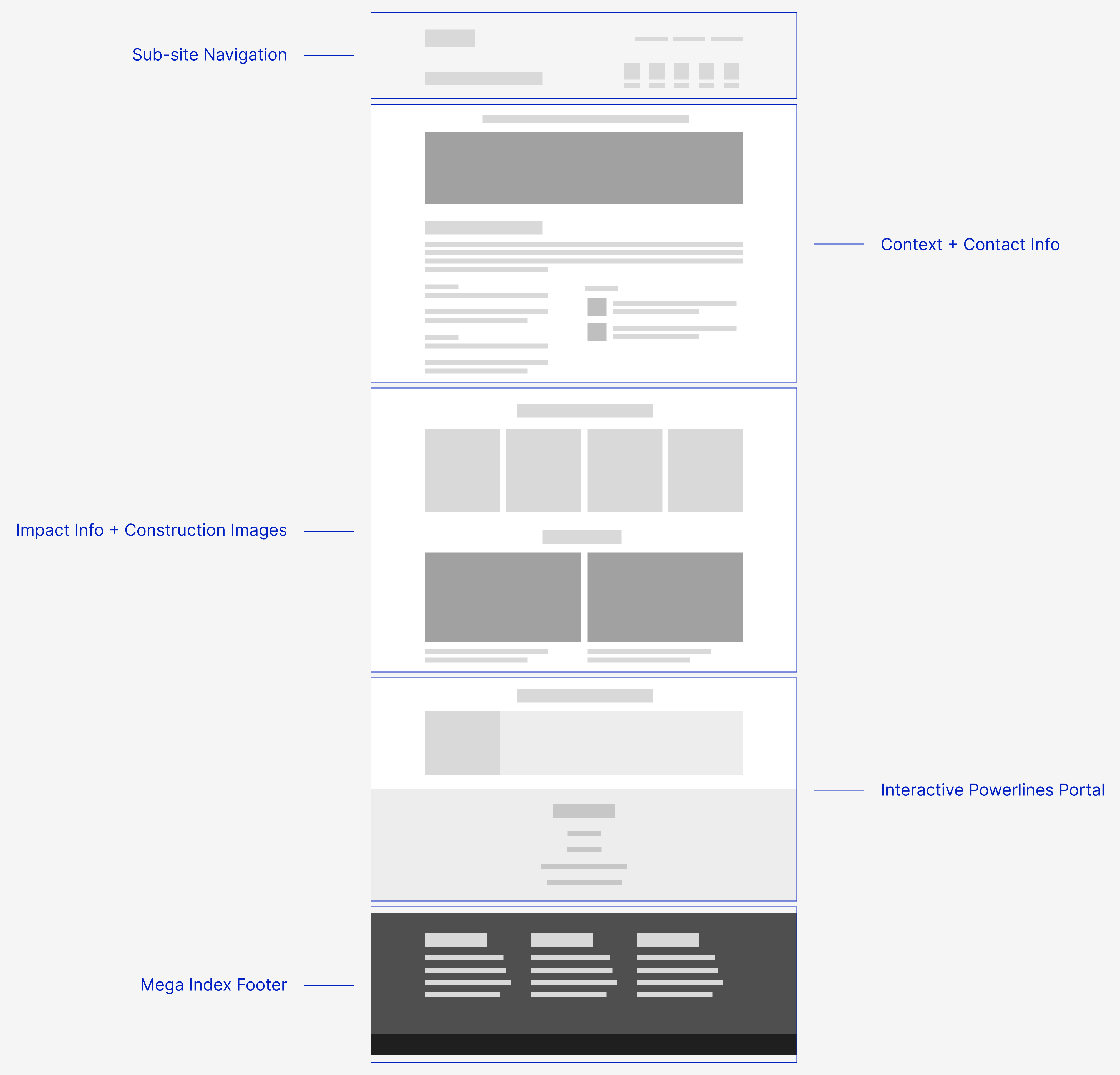
At the same time, a more detailed sub-site concept with its own navigation was created. This idea focused on creating a tailored space to better serve the needs of powerline project stakeholders and homeowners.
Idea 2 Wireframe: Creating a subsite with new navigation
WCAG + SECTION 508
Accessibility was always at the forefront of every decision.
Accessibility was a core principle throughout the design process. The sub-site was crafted to adhere to web accessibility standards, guaranteeing that all users, including those with disabilities, could access and interact with the content effortlessly.
This encompassed considerations like clear and consistent typography, keyboard navigation support, alt text for images, and the use of semantic HTML to ensure a barrier-free experience for all users.
SOLUTION
With the budget set, the subsite solution was chosen.
The powerline pages were designed to be adaptable and scalable for any type of content. To accomplish this, we identified the essential elements of the site and transformed them into reusable components.
These components were then combined to create the platform's key pages, including the introduction, map, legal, meeting, and timeline pages. These core pages served as the foundation of the platform, providing a flexible structure to accommodate a wide variety of powerline projects.

UI DESIGN
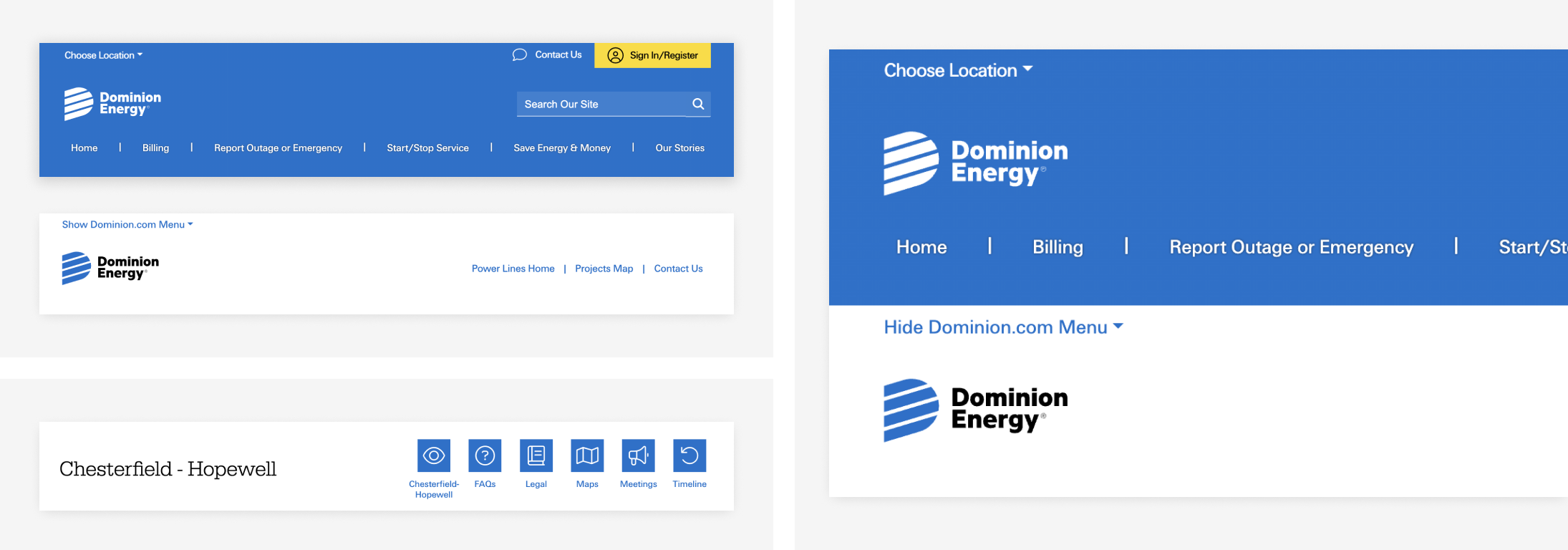
The challenge was balancing a unique sub-site look with Dominion Energy's design system.
The challenge lay in striking a balance between achieving a distinct appearance for the sub-site while preserving its integration into Dominion Energy's overarching design system, thus ensuring brand consistency.
The navigation structure was a critical UX component that demanded significant attention. In particular, the alignment of the sub-site's navigation with Dominion Energy's main header was pivotal to maintain a cohesive user journey.

MAP MAKING + GIS
A map feature was integrated using Geographic Information system (GIS) technology.
GIS technology was used to develop the map feature, enabling homeowners to explore powerline projects either by entering their zip code or by navigating directly on the interactive map.
Geographic information system (GIS) integration
POWERLINES PROJECTS
Organizing Extensive Content with Clear Navigation
The powerlines team initially presented projects containing an overwhelming amount of content. Collaboration with their team led to organizing this information into a structured format.
The solution was to include intuitive page navigation, breaking the content into manageable sections to enhance usability and accessibility.
Powerlines project page
SUMMARY
Final thoughts & looking to the future.
The powerlines project focused on creating a scalable platform to organize extensive content across multiple projects. Core pages were built using reusable components, and an interactive GIS-powered map allowed homeowners to explore projects.
While the project successfully achieved its goals, if there was more time (& budget), more comprehensive accessibility testing would ensure the platform meets the needs of a diverse audience. Additionally, refining interactions could enhance the experince and make navigation even more intuitive.
© 2025 Neer Patel