
Dominion Energy
Using data and empathy to understand user needs at Dominion Energy
Summary
Like many websites, Dominion Energy recognized the need for a website overhaul due to its outdated design. They sought to revamp the user experience (UX) by implementing an improved information architecture and enhancing the user interface (UI).
The end result involved a comprehensive restructuring and decluttering of the website, prioritizing a refined information architecture and enriched UX copywriting. The primary focus was on optimizing the user journey, emphasizing the pathways users typically follow to access information and accomplish tasks, such as understanding their billing statements and facilitating payment processes.
Role
Research, UX, accessibility, UI design
Collaborators
Product Manager, Developer
Timeline
2021-2022
Problems
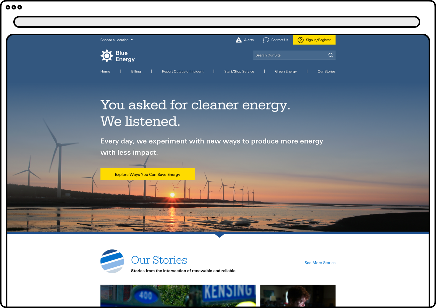
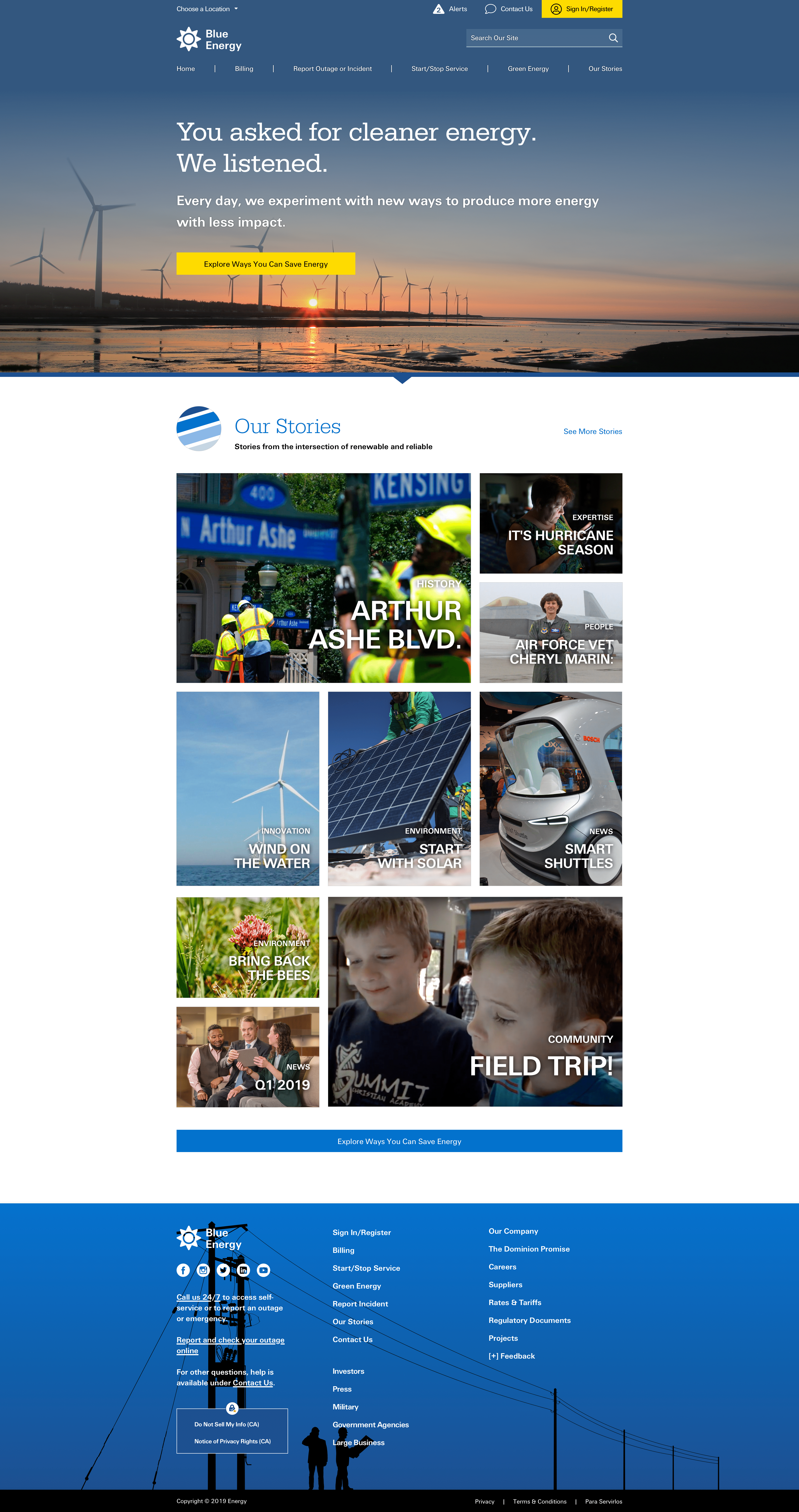
Dominion Energy's website was grappling with several critical issues that hamper its effectiveness and user satisfaction. These issues include an inadequate information hierarchy and a limited UX system, leading to user frustration as they struggle to locate essential information.
- Suffering from confusing and obsolete UI systems, making navigation and interactions cumbersome for visitors.
- Incompatibility with modern devices and browsers, with a limited responsive design, further alienating potential users. Furthermore, security vulnerabilities were noticed due to outdated code and software, potentially exposing sensitive user data to risks.
- Lastly, the lack of contemporary design elements and visual aesthetics could deter users, making it imperative for them to adapt to evolving design trends to remain competitive and user-friendly.
Solutions
- Restructure the information hierarchy and improve the user experience (UX) through user research and clear navigation pathways.
- Overhaul the user interface (UI) to create a modern, intuitive design that ensures compatibility across devices and browsers.
- Prioritize security by regularly updating software, conducting security audits, and enforcing secure development practices.
- Enhance the website's aesthetics with contemporary design elements, engaging visuals, and user-driven improvements, maintaining alignment with evolving design trends.
Research:
To kickstart the UX research for the website redesign, a heuristic evaluation was performed to systematically identify usability issues based on recognized usability principles and best practices. This evaluation revealed areas where the website's usability was lacking, providing valuable insights for improvement. Additionally, tree testing and card sorting exercises were employed to optimize the information architecture.
In the tree testing phase, users' ability to navigate the site's menu structure was assessed. Participants were tasked with finding specific information within the existing website layout, helping to uncover navigation bottlenecks and confusing pathways. Meanwhile, card sorting involved participants categorizing and organizing content into logical groups, shedding light on how users mentally organize information.
The findings from these UX methodologies were then synthesized and used to inform the restructuring of the website's information hierarchy, ensuring that it aligns seamlessly with user mental models and expectations. This iterative and user-driven approach enhances the overall UX, resulting in a website that is not only visually appealing but also intuitively navigable and user-friendly.
Wireframing:
In the UX design phase, rudimentary wireframes were employed as a valuable tool to visualize potential design concepts for presentation to the client. These wireframes served as low-fidelity prototypes, showcasing the proposed layout and structure of the website.
Furthermore, these wireframes played a pivotal role in conducting user tests to assess decision fatigue and task completion challenges. By simulating user interactions with the wireframes, usability testing sessions were conducted. These tests aimed to gauge how users navigated through the proposed designs and whether they encountered any confusion or decision-making obstacles while trying to accomplish their tasks.
The feedback gathered during these user tests was instrumental in refining the design. Iterations were made based on observed user behaviors, preferences, and pain points. This iterative process ensures that the final design not only aligns with the client's vision but also prioritizes a seamless and intuitive user experience, ultimately reducing decision fatigue and enhancing task completion efficiency.

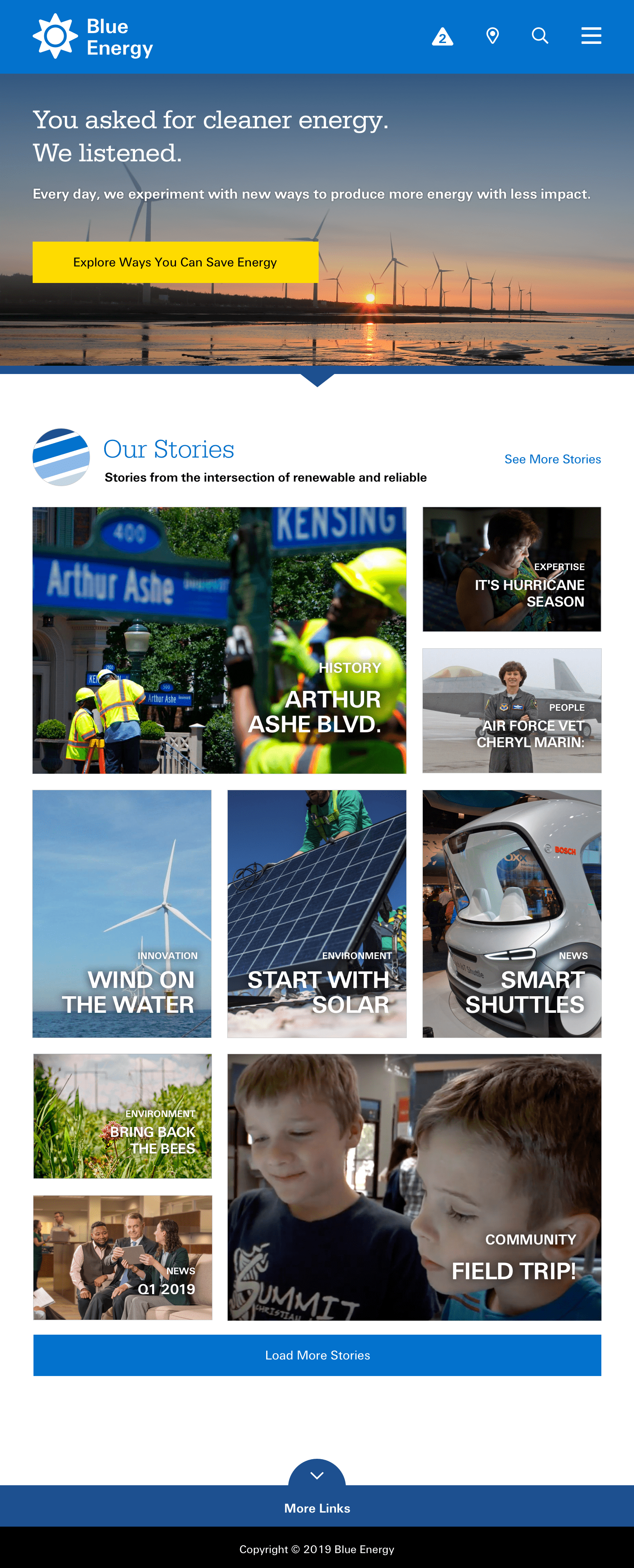
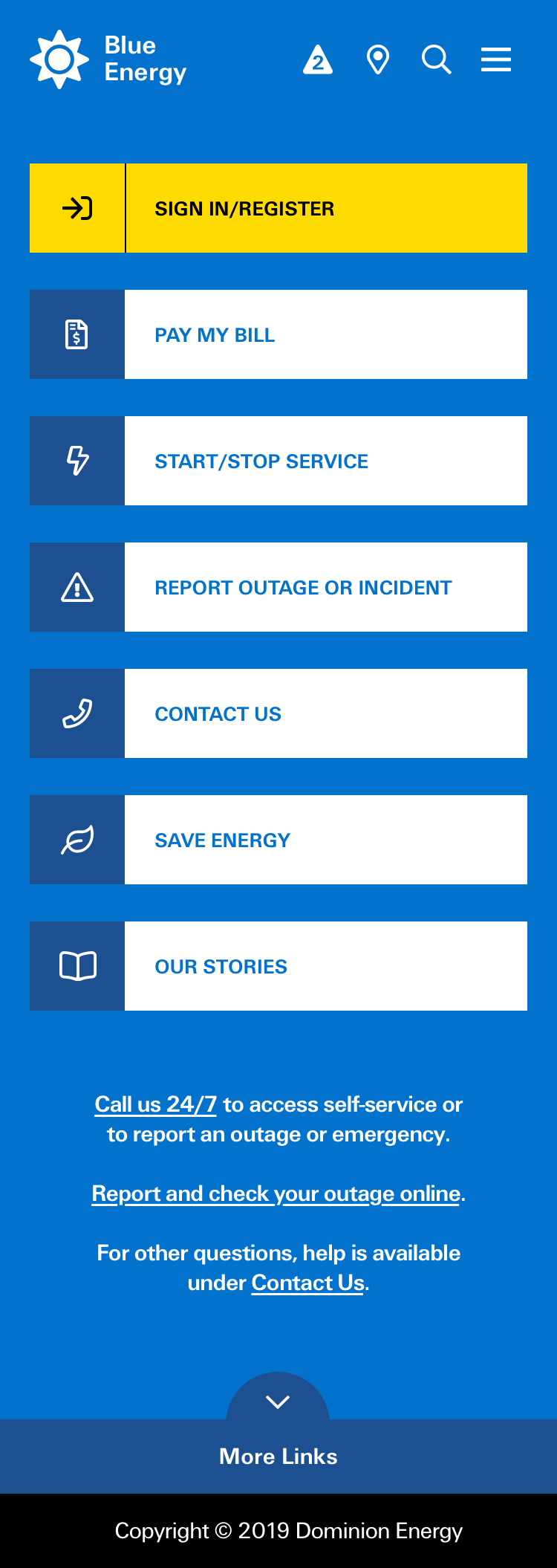
Visual design solution:
In the UI and interaction design phase, a comprehensive overhaul of the website's navigation was executed, eliminating the cumbersome dropdown menu and opting for a streamlined approach with only the most critical tasks prominently featured in the header. This navigation revamp aimed to enhance user accessibility and reduce cognitive load.
To maintain a consistent and visually cohesive user experience, a robust design system was meticulously crafted. This design system ensured that UI elements adhered to standardized styles, making them easily recognizable and accessible across the entire website. It also facilitated modularity, allowing UI components to be deconstructed and reassembled into various configurations, promoting efficient reuse and consistent branding.
Furthermore, the redesign introduced unique design elements, such as a visually striking gradient header and bespoke illustrations. These elements were purpose-built to foster creativity and relevance, allowing the company to differentiate itself visually while aligning with contemporary design trends. These creative touches not only enhance the website's aesthetic appeal but also contribute to a more engaging and memorable user experience.
Summary:
The redesign of Dominion Energy's website was a comprehensive transformation that addressed a range of usability and design challenges. To enhance user experience (UX), a heuristic evaluation was conducted, revealing areas of limited usability based on recognized usability principles. Tree testing and card sorting exercises were employed to optimize the information hierarchy, ensuring intuitive navigation.
In the UI and interaction design phase, the navigation was revamped, replacing a complex dropdown menu with a simplified header featuring only the most essential tasks. A consistent design system was created, ensuring a unified visual identity and modularity for UI elements. Additionally, unique design elements like a striking gradient header and custom illustrations were introduced to add creativity and relevance to the site.
Overall, the redesign focused on aligning the website with contemporary UX/UI best practices, resulting in a visually appealing, user-friendly platform that enhances accessibility, efficiency, and engagement for Dominion Energy's customers.
Neer Patel